


Gallery
On this page are a few projects
DPI has done, ranging from logos, books and magazines to
photo montages and posters. Click on the thumbnails to see a larger image.
|
|
|||
|
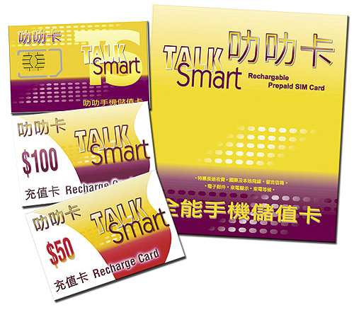
The TalkSmart SIM card package complete with recharge cards. Developed for a Trident Telecom client, the design has since gone on to influence the client's retail outlets and product packaging and promotional literature. |
|
EasyLAN is a broadband networking solution provided by MSL -- also part of the Infobiz group. This logo is used on a variety of items from brochures and wall sockets to packets for Ethernet cabling |
|
|
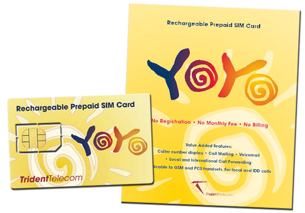
Yoyo is the marque of one of the mobile telecom products offered through Trident Telecom. The SIM card package can be seen at the right. |
|
|
2000.jpg) |
A little something I developed for the title graphic for a listing of financial services companies in AmCham magazine in June 2000. Incorporating a scan of real money along with Dollar and Euro symbols, I ended up treating it as more of a painting than a photo montage. |
|
Logo for Trident Telecom Ventures Ltd, Hong Kong's first MVNO. Part of the Infobiz group of companies. |
|
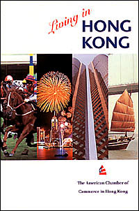
The cover of the 11th Edition of Living in Hong Kong. Published by The American Chamber of Commerce in Hong Kong. The idea was to present facets of Hong Kong life while keeping everything as clean and simple as possible. |
|
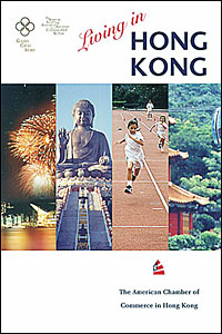
The cover of the 12th Edition of Living in Hong Kong. Published by The American Chamber of Commerce in Hong Kong. |

|
A large lightbox poster for a freight forwarding company. Photos were scanned and modified in Photoshop then imported in FreeHand where everything was composited for final output. |
|
The cover illustration for the 16th Edition of "Establishing an Office in Hong Kong", published by The American Chamber of Commerce in Hong Kong, 1999. |
|
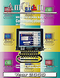
The 6th Edition of Who's Who in Hong Kong Communications. With embossed chrome/silver effects generated in Photoshop. I originally wanted the background to look like a series of windows receding into infinity (or something like that). But it was deemed "too busy". Placing the new-look website was complicated; thank God for Photoshop's Layers. |

|
The 5th Edition of Who's Who in Hong Kong Communications, by now fully integrated into the January issue of AmCham magazine. Extracting the original typewriter/monitor motif from the original composite was very challenging. |
|
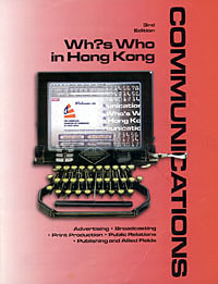
In late 1997, I was commissioned by the American Chamber of Commerce in Hong Kong to revamp their directory, Who's Who in Hong Kong Communications. This was the cover. I had the antique typewriter, but since this was the information age, I wanted to add a touch of Internet. So using a lot of masks and gradients in Photoshop (back then I was still using version 2.5) I "built" the monitor, then composited using a lot of careful selection and blending. The typewriter/monitor motif would carry over to subsequent editions. |

|
Originally intended for an Internet related article in AmCham magazine, this was composited and "massaged" in Photoshop. |
|
|
|||
|
|
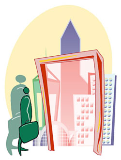
A "skyline" of Hong Kong. Various sources were used from print photos and supplied brochures to side elevation drawings. Put together for an article in Amcham magazine profiling American and American-trained architects in Hong Kong. The montage was optimized to fit a 2-page magazine spread |
|
This graphic is part of the header for the newsletter of a finance management consultancy. Among the techniques used to create this in Photoshop were: the Find Edges, Watercolor and film Grain filters, gradient masks and fills, layers (lots of them) and layer blend modes, and the Hue & Saturation control in order to get the blue-white-sepia transition . |
Back to top |
|||
 |
Montage done for AmCham magazine in 1997 for a special Information Technology section constructed with scans of an old Apple 17 inch monitor, Nokia celphone and a CD I happened to have handy. After compositing, I built an image mask in order to make the glow effect. |
 |
A half-page illustration/headline for a listing of premium office rentals for a special section feature in Amcham magazine. May 1999. |
|
Logo for the Interior Design Association of Hong Kong. When the Association was first established in the early 1990s, there was a competition for a logo design. I developed three different designs -- and forgot to submit them all (I was too busy helping organize the competition!). Finally, when the need for calling cards and letterheads, and a newsletter arose, the IDA found none of the winning entries suitable. Then I remembered I had these logo designs -- I got a good thumping for not having submitted them in the first place -- and this was chosen. |
 |
A logo designed for a friend's company. It needed to be clean and striking. The name did pose a bit of a challenge, but once I stopped treating it as a set of words and looking at it as a graphic element, things fell into place. |
|
|
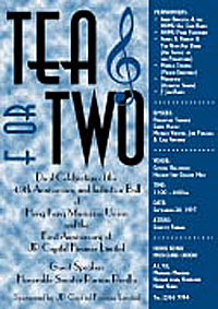
In 1996, I was asked to design a poster for a joint "anniversary" celebration, of a musicians' union and a finance company. Everybody wanted a mention, hence the list down the right hand side. |
|
|
|